Every business has its front-facing features that the customers see. Yet, behind the scenes, internal processes allow everything to work. While these processes may not be visible, they are significantly important, possibly more important than the external ones. How? Let's look closer.
Internal Processes: Hidden but Vital
Think of the internal processes of a software product like the backroom staff at a busy restaurant. They wash the dishes, prep the food, and keep everything running smoothly. You might not see them when dining, but their role is important. But what happens when the restaurant gets busy? The staff gets overwhelmed, and the service suffers.
How the restaurant manager could have avoided this situation? By hiring more staff? Not necessarily. He should have collected data on the number of customers, the busiest hours, and the average time taken to serve a customer. This data would have helped him make informed decisions about the staffing requirements.
Just like these staff members, internal processes help software provide a good user experience and perform efficiently. Similarly, if the internal processes of a software product are not optimized, the user experience can be affected. To make these processes work even better, they need to generate abundant logs and data points. Data is valuable.
Why More Data Matters
Data collection is like painting a masterpiece. The more details you have, the more accurate and refined the final picture. In software, ample data points can uncover patterns and trends, offering insightful clues to improve processes, user experience, and the overall performance of the product. It can provide valuable navigation markers, guiding an indie developer or a startup owner through the uncharted waters of business. But collecting data is just the first step. The real magic lies in visualization.
It is important to think of data as a raw material that needs to be processed and refined to extract its true value. And this is where data visualization comes in.
Making Sense of a Gold Mine
Imagine a treasure chest full of gold nuggets in different shapes and sizes. To anyone unfamiliar with gold, this assortment could be overwhelming and incomprehensible. This is where data visualization comes in. It dissects the complex data points into a format that is easy to understand, in the form of charts or dashboards. Essentially, it converts the jumble of gold into clearly defined, usable assets.
Simply put, proper visualization is the intersection between raw data and the person who needs to interpret it. For instance, a salesperson may find line graphs more helpful to track sales trends over time, while a businessperson might prefer pie charts to study market share. Similarly, a developer can use heat maps to identify the most clicked areas on a product page. So, the key is to select the visual that complements your data type and aligns with the viewer's requirements.
A Key Tool for the Indie Developer
For an indie developer, operating in a competitive tech environment can be challenging. Data visualization helps clarify your current position and possible future. It aids in making data-driven decisions by delivering real-time insights, trends, and metrics at a glance. Therefore, turning diverse data sets into intuitive visuals can help an indie developer make educated guesses about the product's future.
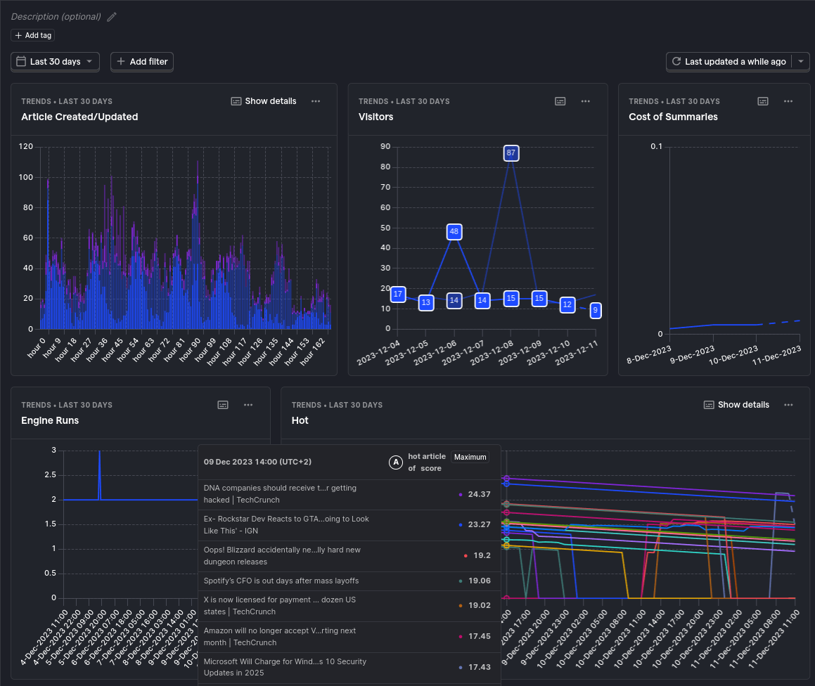
The into image shows a dashboard that I created for the News project. I am using PostHog to collect data and visualize it. The dashboard shows what is important to me as a developer. I need to visualize the data for the features tha come next. It show (in order)
- Article Created/Updated: This shows how many articles are created and updated by the internal scraper. This is important to me because I need to know if the scraper is working properly.
- Visitors: This shows how many visitors are visiting the site. This is important to me because I need to know if the site is getting any traffic. For now, I am not doing any marketing, so I am not expecting a lot of traffic. Initially, I was getting too many visitors, but I realized that I was not filtering out the bots. So, I added a filter to exclude the bots.
- Cost of Summaries: This shows how much it costs to summarize the articles. This is important to me because I need to know if the cost is too high. I am using OpenAI to summarize the articles that it a pay as you go service.
- Engine Runs: This shows the scheduler execution. This is important to me because I need to know if the scheduler is running as expected.
- Hot: This shows how the ranking of the Ranking Algorithm degraded over time. This is important to me because I need to know if the ranking algorithm constants need to be adjusted. This is one of the most important metrics for me as I could not find any other way to measure the quality of the ranking algorithm.
Conclusion
In today's business environment, overlooking the role of internal processes of a software product is not an option. By harvesting a wealth of data and communicating it effectively through savvy visualization techniques, businesses can find the potential of these processes. And when we speak of indie developers, the shift from guesswork to evidence-based decisions powered by visualization can be transformative. So, let the data collection begin, and turn on the lights of your dashboard - your path to success starts here.
This article was generated with the assistance of AI and refined using proofing tools. While AI technologies were used, the content and ideas expressed in this article are the result of human curation and authorship.
Read more about this topic at: Importance is All You Need